If you are new to Enterprise Recovery, welcome! The website was launched earlier in November 2016 after considerations of branding and building out the new website. If you've named, branded and marketed a B2B company before, you have some idea of the process of brainstorming and shooting down ideas. Such is the story with the Enterprise Recovery logo...
What's in a Name?
Shakespeare is quoted as saying, "What's in a name? That which we call a rose by any other name would smell as sweet." Well, Mr. Shakespeare hasn't tried branding in the 20th century.
Discussions for the name of our new company began earlier in the summer. As a part of BYL Companies, we knew the focus of the new company would be B2B and commercial collections. Originally, corporate collections was handled by our sister company, BYL Collections. Recognizing the vast differences between consumer and commercial collections, we split off the corporate collections to form this new company. With more focus on business relationships and debt collections offerings, we included existing clients in the decision-making process. Finally, in September, we all agreed on a name that would seem obvious for corporate collections: Enterprise Recovery.
Branding 101
Defining a brand means making it unforgettable in the eyes of the customer. In this case, our customer would be other businesses. With this in mind, we knew our branding would appear on the website and business cards but also, perhaps, on a sign sponsoring a hole at a golf tournament. What logo could we possibly design that would say, "commercial debt collections"?
We did want to stick with an overall feel, similar to our other sister companies. Bold colors and design fonts allow the viewer a particular sense that we're not your regular debt collection agency. We looked at options that included buildings and coins, all in the name of "business" and "money", with the hopes that we didn't brand ourselves as a bank.
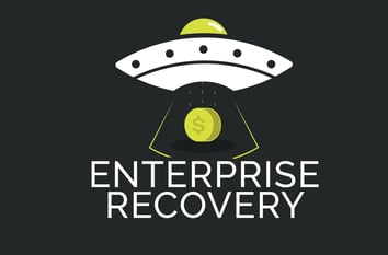
Our designer, thankfully, has worked with us on branding other BYL Companies so she recognized the opportunity to reach beyond your typical business logo. Still, the first options didn't win over everyone involved with the decision-making. After a few iterations, our designer threw an extra-terrestrial idea our way and we loved it:

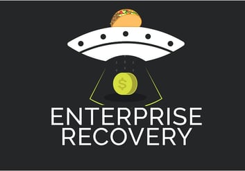
Again, there were a few changes made to this original idea, especially since someone said it appeared to be a taco sitting on top of a sombrero. Do you see that?
Debt Collections Out of This World
Alas, with a great logo comes great copy, if you can help it. With the final logo, we were inspired to go along with the modern, futuristic theme and build copy around this idea. We like saying, "bring your cash back into orbit" because that's what we do best.
Backed by a successful recovery rate and the best collections specialists, we're proud of our spaceship logo and the representation of recovering dollars. And now you know the whole story.


